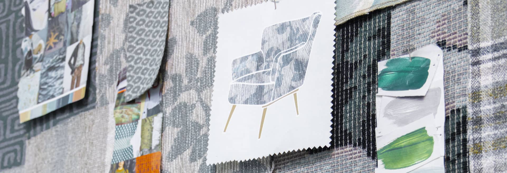
Cover Competition *APPLY NOW*
On behalf of the International Textile Alliance’s Educational Foundation, the ITA is pleased to bring to you another opportunity to gain exposure in the home furnishings industry for your school and students. The Interwoven Textile Fair by ITA Show Guide Cover Competition.
Twice a year the Interwoven Textile Fair by ITA Show Guide is printed and distributed. We would like to give you the opportunity to create a print, dobby, or jacquard fabric design that will be applied to the cover. Below you will find the guidelines for the “Cover Competition.” The winning student will receive a $500 monetary award and exposure in the Interwoven Textile Fair by ITA Show Guide publication.
Submission Deadline
April 23, 2026 for the Spring Guide
October 6, 2026 for the Fall Guide
Please narrow your selections by pre-screening, only 6 entries
per school will be accepted. Feel free to contact our office with
any questions. (336) 885-6842


I created this pattern as part of a wallpaper collection for hospitality, celebrating the rich artistry, heritage and craftsmanship of the City Palace in Udaipur, India. Drawing inspiration from its traditional artistic techniques, intricate wall paintings and grand architecture, I hand-painted gouache motifs— including a running stitch texture inspired by Indian Kantha embroidery— using a palette influenced by natural earth pigments in old wall paintings. These motifs were then digitized and arranged into a seamless pattern to evoke a sense of storytelling. This, combined with the interplay of bright and muted tones, brings the refined versatility of the interiors that inspired me, blending cultural heritage with modern elegance.
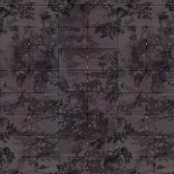

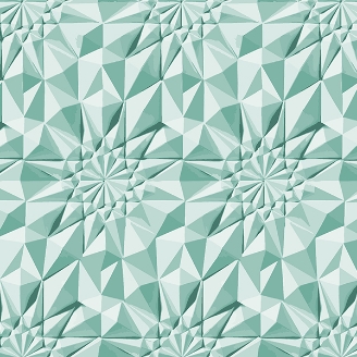
When handling and protecting something precious, we fold. When organizing thoughts or pausing before a new beginning, we fold our intentions inward. In Korean, this act is expressed by the verb “蕾朝棻 (jeop-neun-da).” In moments of silence, I unconsciously folded paper—again and again—inscribing time into the material through my fingertips. Each crease became a quiet accumulation of memory and presence. Following these traces with slow, deliberate gestures—adding color, rubbing, tearing, piercing— I wove together surfaces that record not just material transformations, but layered experiences of time. Folding is a form of silent performance: a repetitive and meditative act where stillness is internalized through the hand, and time is marked not by clocks, but by accumulated touch. Through this practice, I created textured surfaces that hold within them the immediacy of the hand and endurance of time. These folded and layered gestures evolved into a textural wallpaper design for interior spaces, offering quiet memory and tactile resonance throughout the environment.
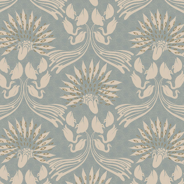

Inspired from the Kravet Archive, I made this design in collaboration with one of their pieces. The result was an art nouveau structure, with a modern twist. My hand-painted bird motifs were inspired by the shapes of art nouveau tulips and botanicals. I took these gouache paintings and digitized them, creating a flowing swan scene. Trying to emulate the fluidity of the trailing linear elements in the art nouveau era, I wanted the design to have a flowing ogee pattern.
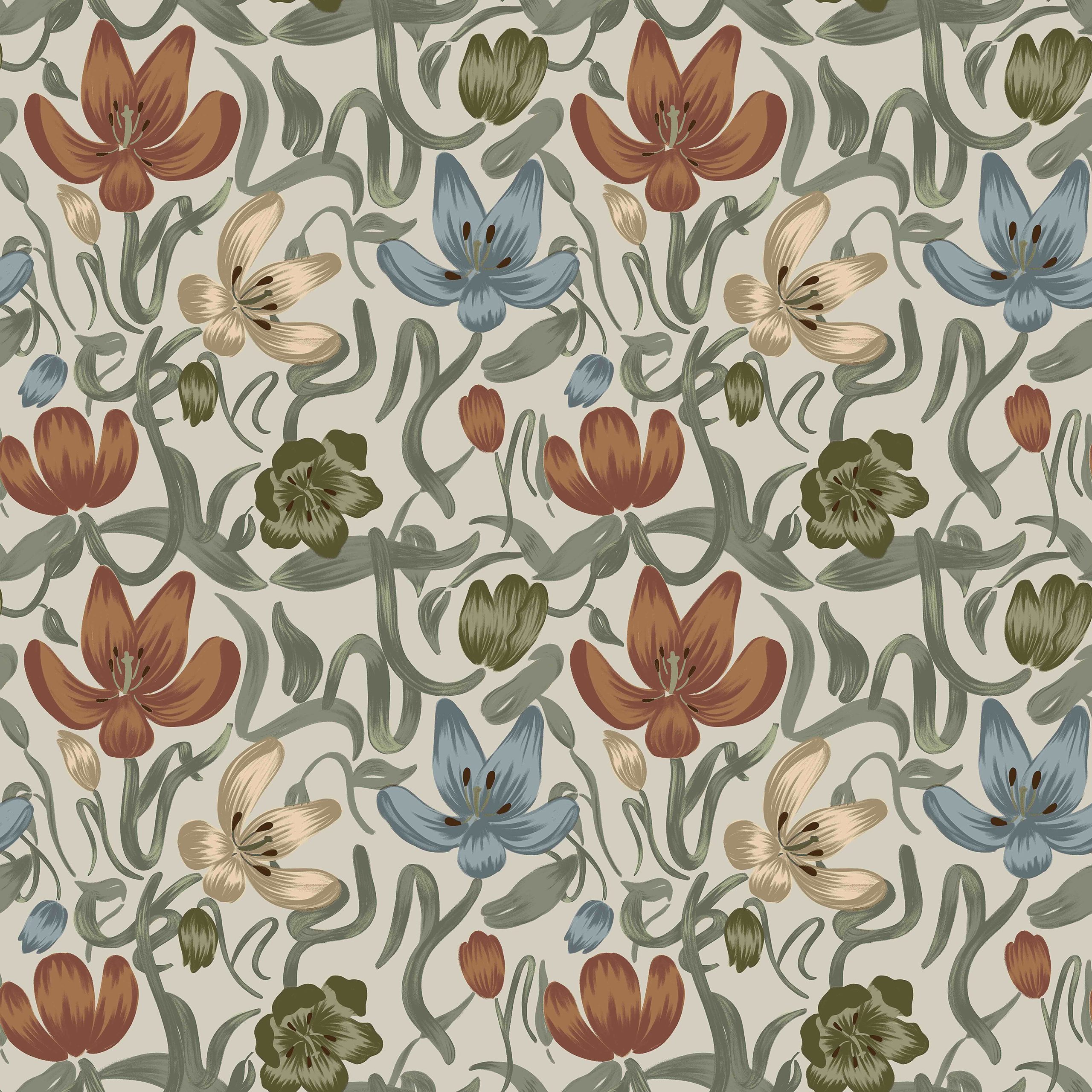

I was heavily inspired by the V-shaped patterns formed by knitting. Knitting patterns are revealed in various articles of clothing that we wear daily. This inspired me to take something comforting, familiar and wearable and translate it into a design suitable for home interiors.
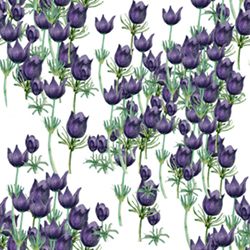

Purple always gives people a feeling of mystery and nobility, and so does the purple tulip. Its flower language is “endless love, no regrets in this life,” symbolizing warm and lasting feelings, whether for lovers or friends. Therefore, I hope that this layered ocean of purple tulips can bring endless and tolerant love to everyone.
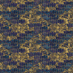

For clients who want to create a timeless look, Emanate is for them. The color palette consists of classical blues paired with ageless golden yellows. To create a visual harmony that will brighten any space, Emanate takes inspiration from shimmering golden lights on the backdrop of a night sky, providing a place where time and color are limitless.
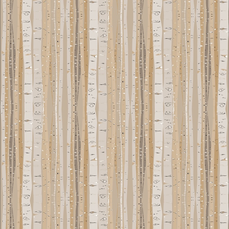
My inspiration was the quaking aspen trees I saw when I visited Utah. I thought the way they climb the sides of mountains was so beautiful. The quaking aspen is actually a colony of biological cloned trees sharing a root system. These clones can stretch for miles, creating their own forests. I wanted to capture the way they crowd together, outnumbering all others in the forest.
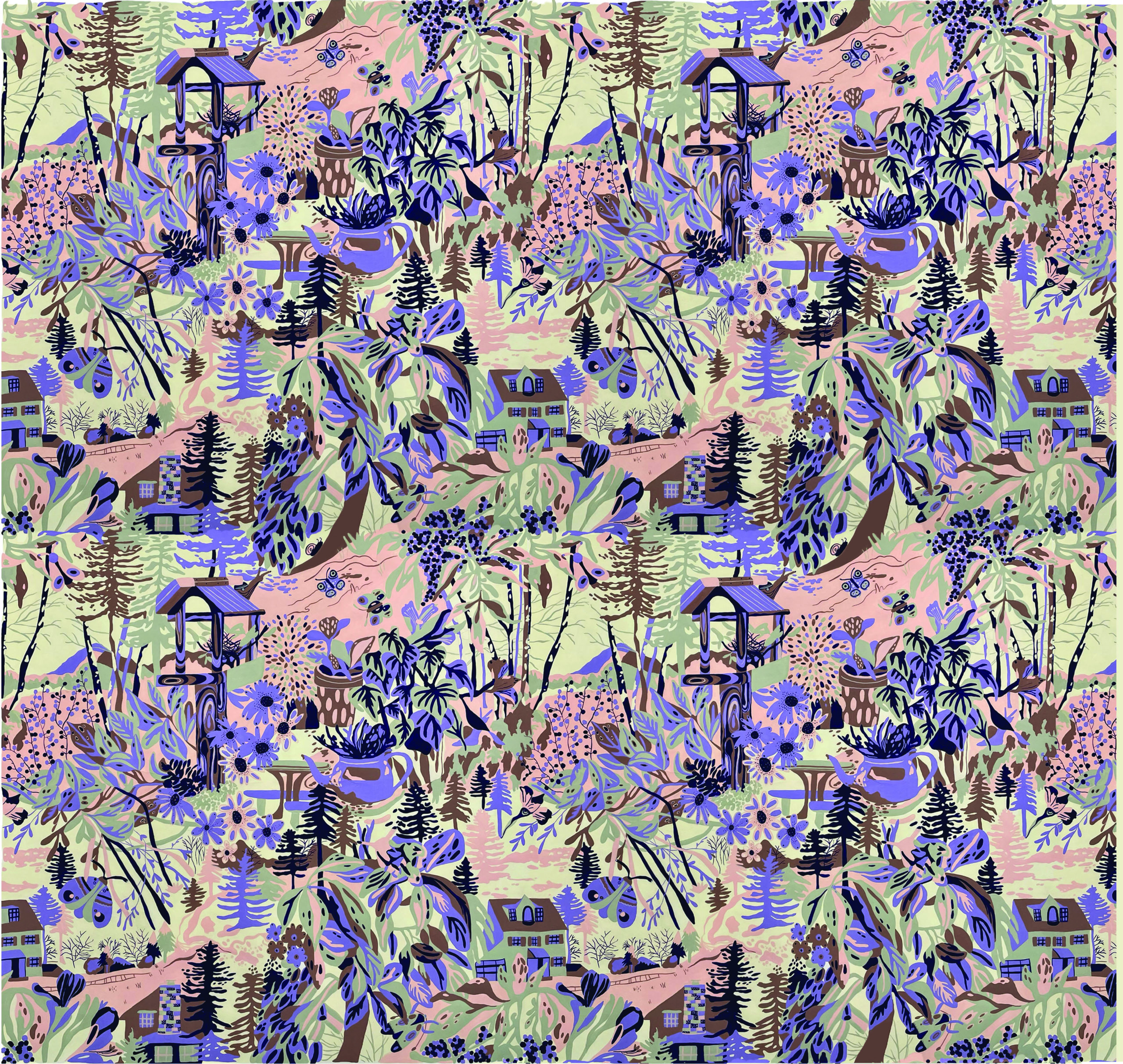

Wild Countryside was inspired by a yearning to be surrounded by nature while dealing with the effects of increased time spent inside due to COVID. All of the motifs were painted on sight at different spots throughout Philadelphia, PA and Ashby, MA. The design was created to allow the viewer to feel less alone amongst the hills, treetops and creatures.
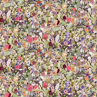

This design was inspired by the work of Yayoi Kusama and her concept of “self-obliteration.” This is the idea of forgetting your identity and becoming one with the universe. I wanted to create a pattern that created the sense of being lost in a field of flowers and becoming one with that environment.
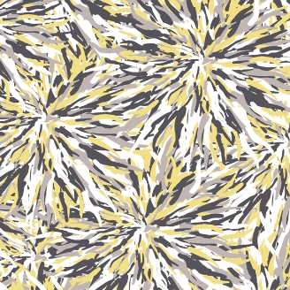

The inspiration for my print comes from the idea of tassels. While sometimes considered to be a small detail, tassels have the power to spruce up any home furnishing (pillows, blankets, curtains, chairs, etc). What fascinates me most about tassels, however, is the large quantity of individual threads it takes to create such a unique texture along with the physical explosion that comes from it. That is what I wanted to emphasize in my design: a soft and comforting firework.
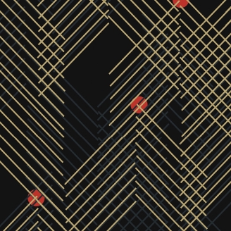

This abstracted mountain print was part of a larger collection focused on the Japanese ideal of yin and yang. The collection entitled “Saints and Sinners” was split into two sections. These sections drew inspiration from symbolic elements within Japanese culture that represent both the positive and negative sides of life. This print in particular drew from the idea of the perfect circle, the balanced mountain, and the peaceful zen garden. The geometric lines represent the repetitive act of meditation much like that of a zen garden. The circles and mountain – like motifs demonstrate the balance that one can achieve through the process. The goal with this print was to take the identifiable Japanese motifs and translate them into a modern repeated pattern, to take the old and make it new.
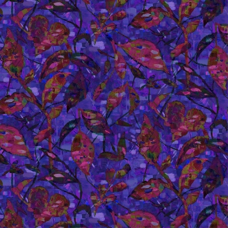

I wanted to emulate artist Moe Brooker’s style by evoking a feeling of joy through color and movement. I used bright colors and quick brush-strokes to create a design with high energy that radiates a feeling of positivity.
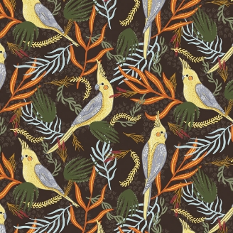

This pattern was inspired by the feathered beauties that flew around my childhood home. While all the other kids had dogs and cats running around their homes, I had Australian cockatiels flying around. These birds hold a close place in my heart and will always be a symbol of comfort, happiness, and home.
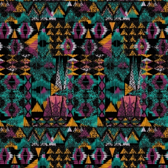

This is a contemporary Aztec pattern inspired from the techno music. It is a euphoric themed print for a high energy environment.
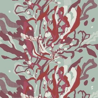

This design was inspired by the beautiful movement of seaweed that’s created by the currents underwater. The elegant leafy collum builds up the fabric creating depth and space while the colors loosely interpret the reds and purple tones that can be found in certain aquatic plants.
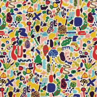

This design was inspired by the weather patterns and mapping in everyday society. It represents humanity, nature, and community within it. This pattern is composed of a singular unit made from couching on a long arm quilting machine. By building up layers and layers, I was able to make my own textile through different dyed yarns. This is a story about everyday life and what we are granted with on a daily basis.
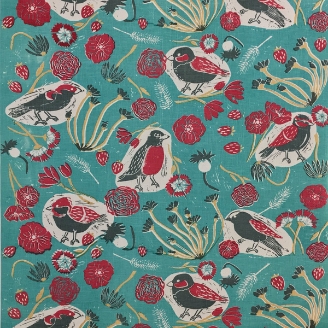

Jane Eyre
Ever since reading the book, Jane Eyre, I’ve been inspired by Charlotte Bronte’s novel. Every flower used in the design is mentioned within the book, and the birds are a reference to Jane as she often calls herself a bird of sort.
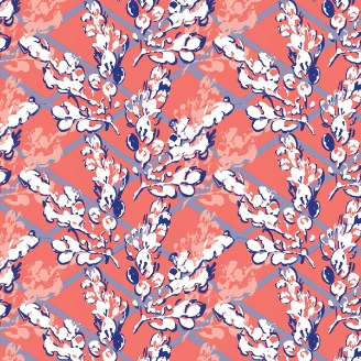
Bubble Leaves
The inspiration for this repeat pattern comes from learning to let the nuances of nature and the process of creating to show through in a design. I created mono-prints by rolling ink onto various sprigs and leaves and pressing them to paper, and one set stood out with the organic yet defined shapes. I then scanned in the image, inverted and filled the color and began rearranging the sprig to showcase the natural beauty of the mono-print that would not have been reached solely by drawing. The assignment for my screen-printing
class was to utilize only two colors for the design, so I also played around with stretching the values and dimension with a half-tone effect of two different sizes for both a shadow and lattice-work structural grid. The unit for repeat was printed out onto transparency paper and transferred
to my two 23″ x 36″ screens. I screen-printed the design by hand onto 4 yards of cotton poplin with 3.5×11 units with an additional colorway on 4 yards in reverse values of a light green and aqua.
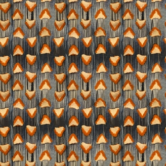

Inspired by a handmade paper yarn Japanese Shifu Kimono, I noticed writing from the original paper was visible on the surface of the cloth. Thinking about this idea of hidden stories woven into fabric, I created a series that explored the transition of time and story telling through hand-dyed color gradations and complex, layered surfaces. In this sample I cut long orange yarn floats and used these tails to stuff the triangular pockets.
Although parts of the story have been hidden within the fabric, evidence of their existence is visible through the orange edges on the triangles.

Major: B.F.A. Fibers
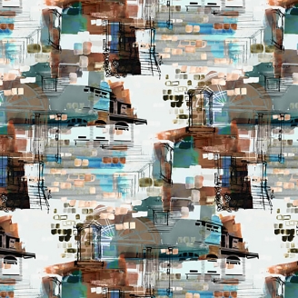
This pattern design developed out of an interest in my environment, specifically the variety of visual information found on the exteriors of houses in Savannah, Georgia. Each home with an individual set of colors, quirks, and textures collaborate to convey an independent personality. When viewed as a community of homes, however, they nestle seamlessly together.
My focus was to capture these qualities by pulling elements from a mixture of the house exteriors and reimagine their interaction through a repeat pattern. These characteristics were then overlapped to evoke a similar experience of walking through the neighborhood streets of Savannah, Georgia.

Graffiti
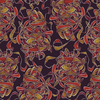
The work is inspired from Australian aboriginal and graffiti art. It is a combination of the spontaneous line work of graffiti, and the patient and thought through process of painting with dots, as seen in aboriginal artworks. The colors are mainly drawn from aboriginal inspirations, but the shapes themselves represent the knotted futures of graffiti letters on walls. Together the two very different styles create an untraditional and visually intriguing pattern. Graffiti is a symbol of differences coming together and the melting pot of culture in today’s society.


Fibers Major
